CitySense
Making city information easier to find and understand.
People notice it when something goes wrong.
Disruptions can affect everyday routines
Updates are scattered and hard to find.
They wanted an easier way to stay informed.
CitySense brings local updates into one place.
City infrastructure is
easy to overlook
Disruptions affect
everyday life
Information is
hard to find
People needed
clearer answers
Bringing city updates
into one place
01
02
03
04
05


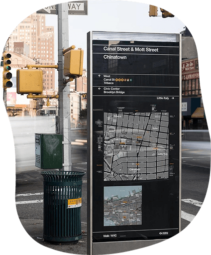


I looked at how residents find information about what’s happening around them and where that information becomes hard to find or understand.
All testers said they would
use Keurig Sync regularly.
METHODS
User Interviews, Usability Testing
DELIVERABLES
Research, IA, UX/UI Design

ROLE
UX Research & UX/UI Design
TIMELINE
Semester Project
THE PROBLEM

Construction, utility work, and street closures are part of everyday city life. But when something happens nearby, it’s not always easy to know what’s going on, why it’s happening, or how long it will last.
City infrastructure is everywhere. Understanding it isn’t.

From Insight to Design

Target Users
I focused on people who want to quickly understand what’s happening in their neighborhood and how it might affect them.
PAIN POINTS
Reliable timeframes
NEEDS
“Just tell me what’s being fixed and for how long.”
Physiotherapist
Ananya

PAIN POINTS
Relevant local information
Clear, simple updates
Scattered city updates
Last-minute disruptions
Information feels overwhelming
Timely local alerts
NEEDS
"I shouldn’t have to check different places to know what’s happening nearby"
Cafe Owner
Diego

PAIN POINTS
Location-based information
One place for city updates
Fragmented information
Unexpected disruptions
Switching between sources
Synthesizing the Research
I organized interview notes and quotes in Miro to find patterns and see what came up repeatedly.


The goal was to turn complex city information into something residents could quickly understand
and use.
How might we make hidden city infrastructure visible, understandable, and useful to residents?
Design Opportunity

Before
After

We simplified the steps and made it easier to see what happens after a report is submitted.
Making Issue Reporting Clearer
01
Show residents what they need to know without overwhelming them.
Testing showed us where the reporting process could be clearer and easier to follow.
Design Evolution
Make Updates Actionable
Design Around Location
The research helped us define three principles that guided CitySense's design.
Design Principles
Simplify the Experience
Make nearby updates easy to find and relevant to where people are.
Show what’s happening, when, and how it might affect them.
Explore the Project
Explore the interactive prototype and key user flows.
02
Making Local Issues Easier to Understand
After
Before


03
Simplifying
Infrastructure Information
We made complex utility information easier to read and understand.
Before
After


We simplified the map so residents could quickly see what was happening nearby.
CitySense taught me that good design isn’t about showing people more information, but helping them quickly understand what matters. Simplifying the way updates are organized and making reporting more straightforward helped turn complex city information into something easier to understand and use.
Project Takeaways
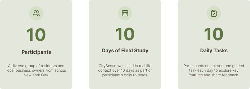
To understand how CitySense would fit into everyday life, we tested the experience with 10 participants over 10 days, combining daily tasks with follow-up interviews.
Field Study & Validation

Legend
Project Details
Report
Map
Dashboard
CitySense brings the most important city updates into one place, so residents can quickly see what’s happening around them.
Final Design
Key Insights
01
People want
clear answers
People want to quickly understand what’s happening nearby and how it affects them.
02
City updates
feel fragmented
Important updates are often spread across different places and are hard to find.
03
Local relevance matters most
People care most about updates that directly affect their neighborhood and daily routine.
Three things came up repeatedly during
the research.
How might we make hidden city infrastructure visible, understandable, and useful to residents?
Design Opportunity
Show residents what they need to know without overwhelming them.
Make Updates Actionable
Prioritize What’s Nearby
The research helped us define three principles that guided CitySense's design.
Design Principles
Simplify the Experience
Make nearby updates easy to find and relevant to where people are.
Show what’s happening, when, and how it might affect them.
Before
After
I simplified the steps and made it easier to see what happens after a report is submitted.
Making Issue Reporting Clearer
01
Testing showed us where the reporting process could be clearer and easier to follow.
Design Evolution
Explore the Project
Explore the interactive prototype and key user flows.
02
Making Local Issues Easier to Understand
After
Before
03
Simplifying
Infrastructure Information
I grouped infrastructure information into clear categories, making it easier to find
what you need.
Before
After
I simplified the map so residents could quickly see what was happening nearby.
CitySense taught me that complex information doesn’t have to feel complicated. The challenge was figuring out what people actually needed to know and making it easy to find.
Project Takeaways
We tested CitySense with 10 participants over 10 days to see how it worked in their everyday routines.
CitySense brings the most important city updates into one place, so residents can quickly see what’s happening around them.
Final Design
The goal was to turn complex city information into something residents could quickly understand
and use
Dashboard
Map
Report
Project Details
Legend
Field Study & Validation

CitySense
Making city information easier to find and understand.
ROLE
UX Research & UX/UI Design
METHODS
User Interviews, Usability Testing
TIMELINE
Semester Project
DELIVERABLES
Research, IA, UX/UI Design
THE PROBLEM
City infrastructure is everywhere. Understanding it isn’t.
Construction, utility work, and street closures are part of everyday city life. But when something happens nearby, it’s not always easy to know what’s going on, why it’s happening, or how long it will last.
From Insight to Design
I looked at how residents find information about what’s happening around them and where that information becomes hard to find or understand.
City infrastructure is easy to overlook
People notice it when something goes wrong.
Disruptions affect everyday life
Disruptions can affect everyday routines.
Information is hard to find
Updates are scattered and hard to find.
People needed clearer answers
They wanted an easier way to stay informed.
Bringing city updates into one place
CitySense brings local updates into one place.
Target Users
I focused on people who want to quickly understand what’s happening in their neighborhood and how it might affect them.
Ananya
Physiotherapist
“Just tell me what’s being fixed and for how long.”
Needs: Clear, simple updates · Reliable timeframes · Relevant local information
Pain points: Scattered city updates · Last-minute disruptions · Information feels overwhelming
Diego
Cafe Owner
“I shouldn’t have to check different places to know what’s happening nearby.”
Needs: One place for city updates · Timely local alerts · Location-based information
Pain points: Fragmented information · Unexpected disruptions · Switching between sources
Synthesizing the Research
I organized interview notes and quotes in Miro to find patterns and see what came up repeatedly.
Key Insights
Three things came up repeatedly during the research.
01
People want clear answers
People want to quickly understand what’s happening nearby and how it affects them.
02
City updates feel fragmented
Important updates are often spread across different places and are hard to find.
03
Local relevance matters most
People care most about updates that directly affect their neighborhood and daily routine.
Design Opportunity
How might we make hidden city infrastructure visible, understandable, and useful to residents?
The goal was to turn complex city information into something residents could quickly understand and use.
Design Principles
The research helped us define three principles that guided CitySense’s design.
Simplify the Experience
Show residents what they need to know without overwhelming them.
Prioritize What’s Nearby
Make nearby updates easy to find and relevant to where people are.
Make Updates Actionable
Show what’s happening, when, and how it might affect them.
Design Evolution
Testing showed us where the reporting process could be clearer and easier to follow.
01
Making Issue Reporting Clearer
I simplified the steps and made it easier to see what happens after a report is submitted.
Before
After
02
Making Local Issues Easier to Understand
I simplified the map so residents could quickly see what was happening nearby.
Before
After
03
Simplifying Infrastructure Information
I grouped infrastructure information into clear categories, making it easier to find what you need.
Before
After
Final Design
CitySense brings the most important city updates into one place, so residents can quickly see what’s happening around them.
Dashboard
Map
Report
Project Details
Legend
Field Study & Validation
We tested CitySense with 10 participants over 10 days to see how it worked in their everyday routines.
10
Participants
Residents and local business owners across New York City.
10
Days of Field Study
Participants used CitySense as part of their everyday routines.
10
Daily Tasks
Each day focused on a different part of the experience.
Project Takeaways
CitySense taught me that complex information doesn’t have to feel complicated. The challenge was figuring out what people actually needed to know and making it easy to find.
Explore the Project
Figma
Explore the interactive prototype and key user flows.