


Verdora
Designing an eco-conscious skincare brand from identity to
digital experience.
All testers said they would
use Keurig Sync regularly.
METHODS
Brand Strategy, Visual Exploration
DELIVERABLES
Brand Identity, Packaging, Website Design

ROLE
Brand & Digital Designer
TIMELINE
Independent Project
PAIN POINTS
01
02
03
04
05

I wanted Verdora to feel calm, natural, and considered. I used organic textures, earthy tones, soft light, and simple forms to bring that feeling across the brand.
Rooted in nature, designed for everyday care.
BRAND DIRECTION
THE CHALLENGE
Verdora started with a simple idea: to create skincare that feels good to use while being mindful of the planet. I brought that vision to life through the brand identity, packaging, and digital experience.
Bringing an eco-conscious skincare brand to life.

VISUAL IDENTITY
A visual system
shaped by nature.
I built Verdora’s identity around soft, organic forms and an earthy palette, creating a system that feels natural without feeling overly rustic.

BRAND SYSTEM
Primary Typeface
Secondary Typeface

Sage
Soft Sage
Cream
Warm Beige
Muted Rose
Dark Olive

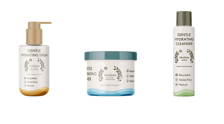
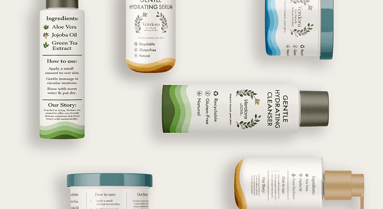
I kept the packaging simple and intentional, using natural tones, minimal graphics, and a cohesive visual system across the product line.
Designed with
less in mind.
PACKAGING DESIGN
A cohesive system, made easy to navigate.
Each product has its own nature inspired color, making the line easy to distinguish while keeping the collection visually consistent.
Daily hydration
and skin balance.
Refreshes and
prepares the skin.
Gently cleanses without stripping moisture
Serum
Toner
Cleanser
PRODUCT LINE
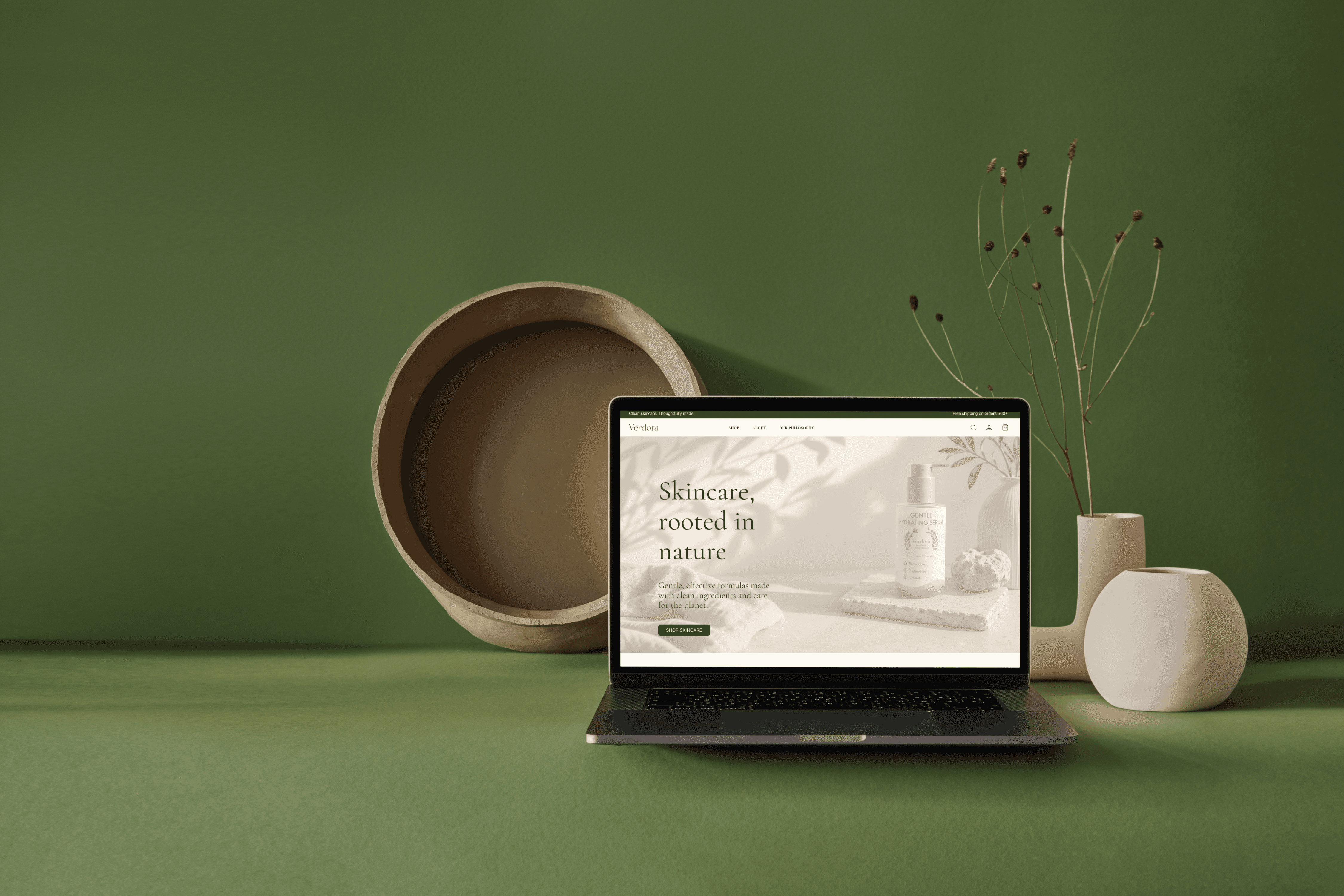
I brought Verdora’s visual identity to the website, keeping the original colors, typography, and calm, natural feel.
Bringing the brand
to life.
DIGITAL EXPERIENCE


01
A Calm
First Impression
I wanted the homepage to feel calm and natural while clearly introducing Verdora and its products.
I kept the shop straightforward, giving each product space to show what it is, what it does, and how it fits into the routine.
Easy to Explore
02
The philosophy page gives a closer look at Verdora’s values, from the ingredients to the packaging and everyday care.
Philosophy
of Verdora
03
EXPLORE THE PROJECT
View the complete Verdora visual identity and brand guidelines.


Explore the full website design and screens
in Figma

Project Takeaways
Working on Verdora taught me to think about the brand as a whole, from the packaging to the website, and how each part can still feel like it belongs to the same system.


Verdora
Designing an eco-conscious skincare brand from identity to digital experience.
ROLE
Brand & Digital Designer
TIMELINE
Independent Project
METHODS
Brand Strategy, Visual Exploration
DELIVERABLES
Brand Identity, Packaging, Website Design
THE CHALLENGE
Bringing an eco-conscious skincare brand to life.
Verdora started with a simple idea: to create skincare that feels good to use while being mindful of the planet. I brought that vision to life through the brand identity, packaging, and digital experience.
BRAND DIRECTION
Rooted in nature, designed for everyday care.
I wanted Verdora to feel calm, natural, and considered. I used organic textures, earthy tones, soft light, and simple forms to bring that feeling across the brand.
01
01
Rooted in Nature
Rooted in Nature
Inspired by nature, from colors to forms.
Inspired by nature, from colors to forms.
02
Thoughtful Ingredients
Thoughtful Ingredients
Simple ingredients chosen with care.
Simple ingredients chosen with care.
03
Conscious Materials
Conscious Materials
Less waste, with materials chosen thoughtfully.
Less waste, with materials chosen thoughtfully.
04
Gentle Care
Gentle Care
Gentle formulas made to feel good on the skin.
Gentle formulas made to feel good on the skin.
05
Everyday Rituals
Everyday Rituals
Simple skincare made for everyday routines.
Simple skincare made for everyday routines.
VISUAL IDENTITY
A visual system shaped by nature.
I built Verdora’s identity around soft, organic forms and an earthy palette, creating a system that feels natural without feeling overly rustic.
BRAND SYSTEM
New York
Primary Typeface
Helvetica Neue
Secondary Typeface
Dark Olive
Sage
Soft Sage
Cream
Warm Beige
Muted Rose
PACKAGING DESIGN
Designed with less in mind.
I kept the packaging simple and intentional, using natural tones, minimal graphics, and a cohesive visual system across the product line.
PRODUCT LINE
A cohesive system, made easy to navigate.
Each product has its own nature inspired color, making the line easy to distinguish while keeping the collection visually consistent.
Serum
Daily hydration and skin balance.
Toner
Refreshes and prepares the skin.
Cleanser
Gently cleanses without stripping moisture.
DIGITAL EXPERIENCE
Bringing the brand to life.
I brought Verdora’s visual identity to the website, keeping the original colors, typography, and calm, natural feel.
01
A Calm First Impression
I wanted the homepage to feel calm and natural while clearly introducing Verdora and its products.
02
Easy to Explore
I kept the shop straightforward, giving each product space to show what it is, what it does, and how it fits into the routine.
03
Philosophy of Verdora
The philosophy page gives a closer look at Verdora’s values, from the ingredients to the packaging and everyday care.
Project Takeaways
Working on Verdora taught me to think about the brand as a whole, from the packaging to the website, and how each part can still feel like it belongs to the same system.
CitySense
Return Home